
This is EB's comment:
- Absolutely dreamy!! I think that totally sums it up...something as simple as this will look good with some hand stitching - maybe just sort of random all over dots or small stitches - which will reward the viewer for coming in closer...if you're not already stuck down..you might try the purple against a very soft mellow yellow sky....might have an even lighter dreamier feel to it. The grey is really quite somber - though that could be my monitor....
beautiful simple idea...
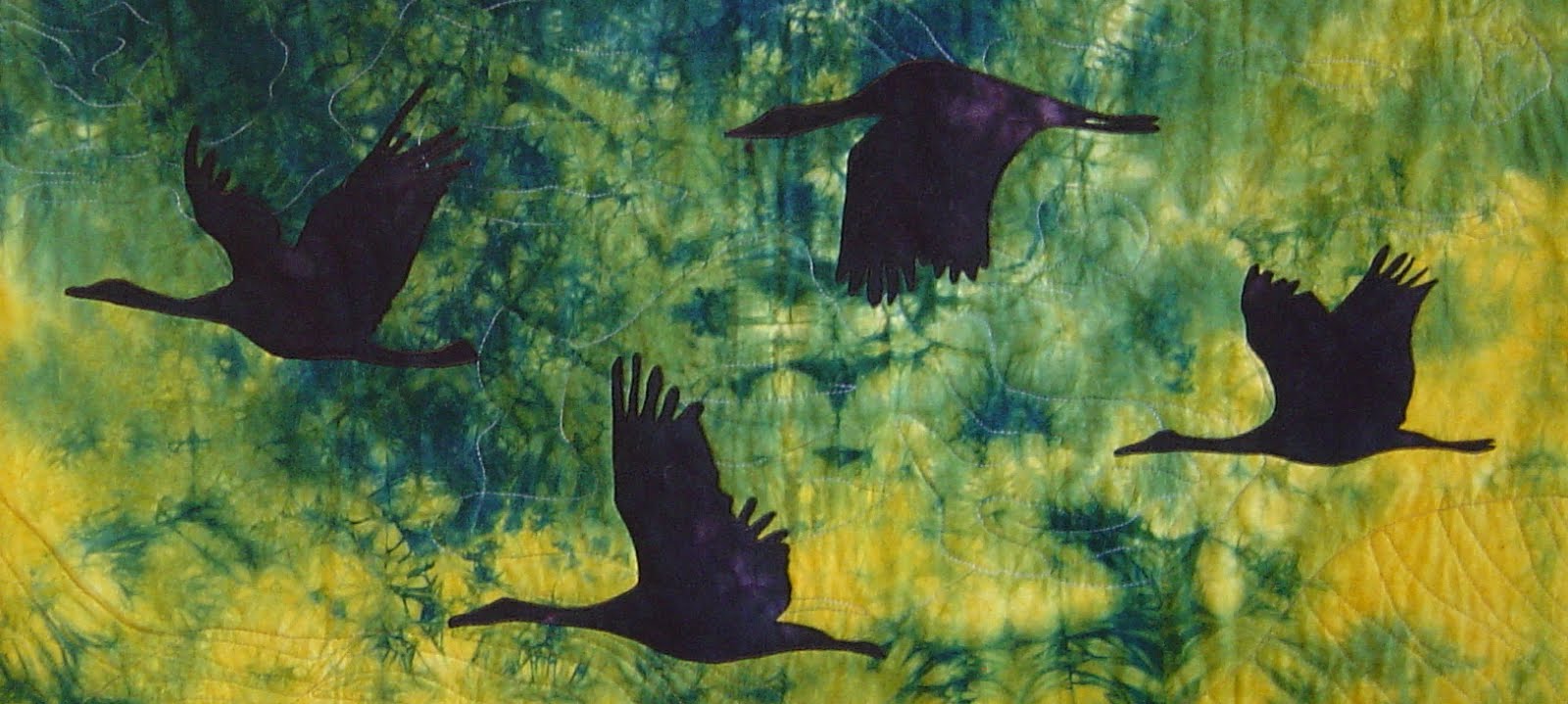
You can make a design complicated, but quite often a simple one is more effective :-). As EB suggested I tried the leaf on different backgrounds. Here is one a light yellow/brown batik:

And here with a green batik:

They are indeed more dreamy. I think the green one is my favorite.
1 comment:
I confess I prefer the darker background, and/or the 'gold' to the green. Can't quite pinpoint why...but the green seems (in my eye or through my monitor) to clash. The darker background melds...mystery; the gold contrasts...richness. Just a thought...or two...
Post a Comment